Test web push on your website
Get started for free
The trial version includes all features
Your first steps in PushPushGo
You will find this in the main menu on the left hand side, under the tab Desktop. Here you will find aggregated data about your subscribers and their reactions to your campaigns in different time intervals.
To choose a specific interval which you want to analyze, use the blue slider under the main chart. The standard interval is “the last fourteen days”.

You can choose any period from the last 3 months.
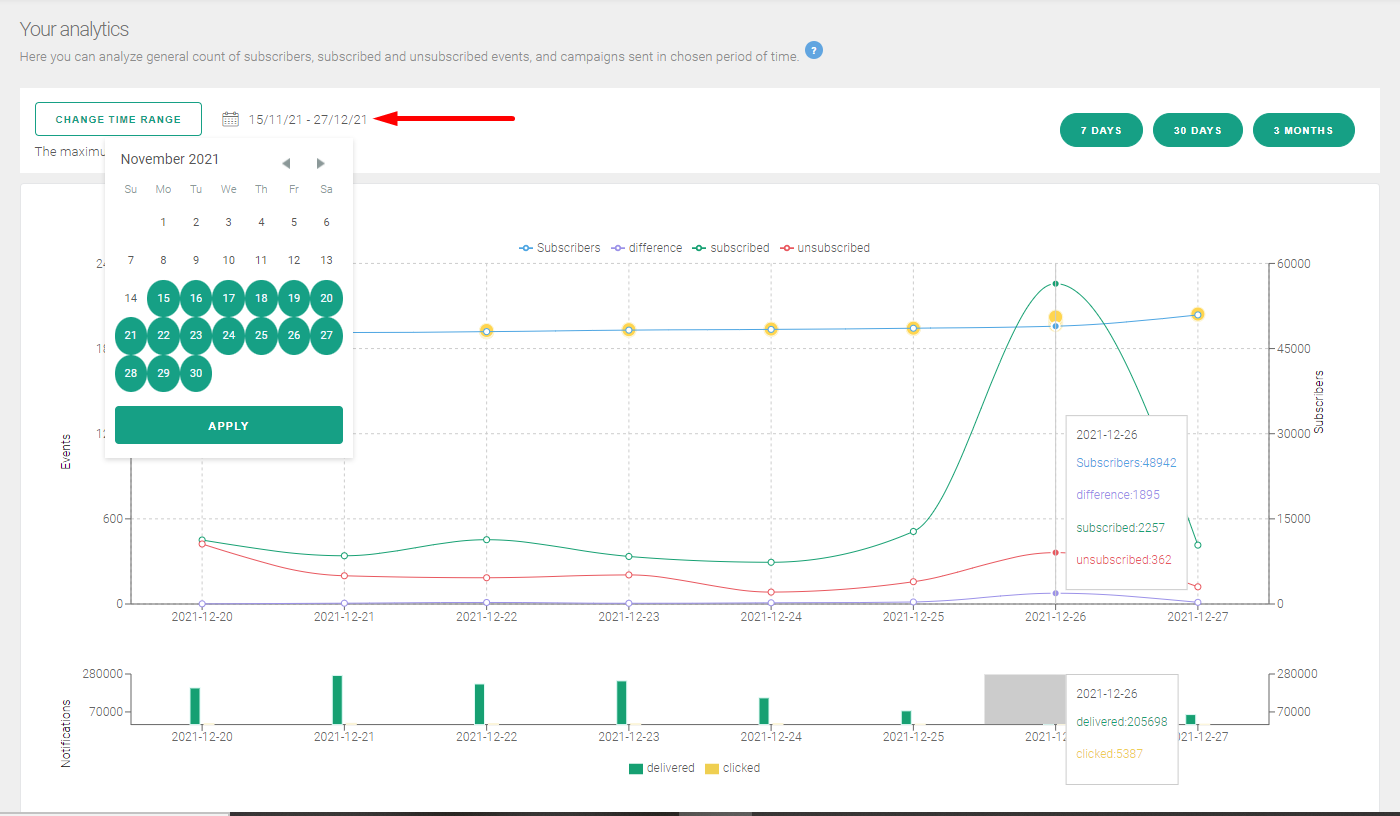
Yellow points on the chart mean that a given campaign has been sent.

When you put your mouse cursor over any given campaign you will see:
Does our analytical panel lack any metrics that would make everyday work easier for you?
Go ahead and let us know and we will put them on the chart as soon as possible!